Color
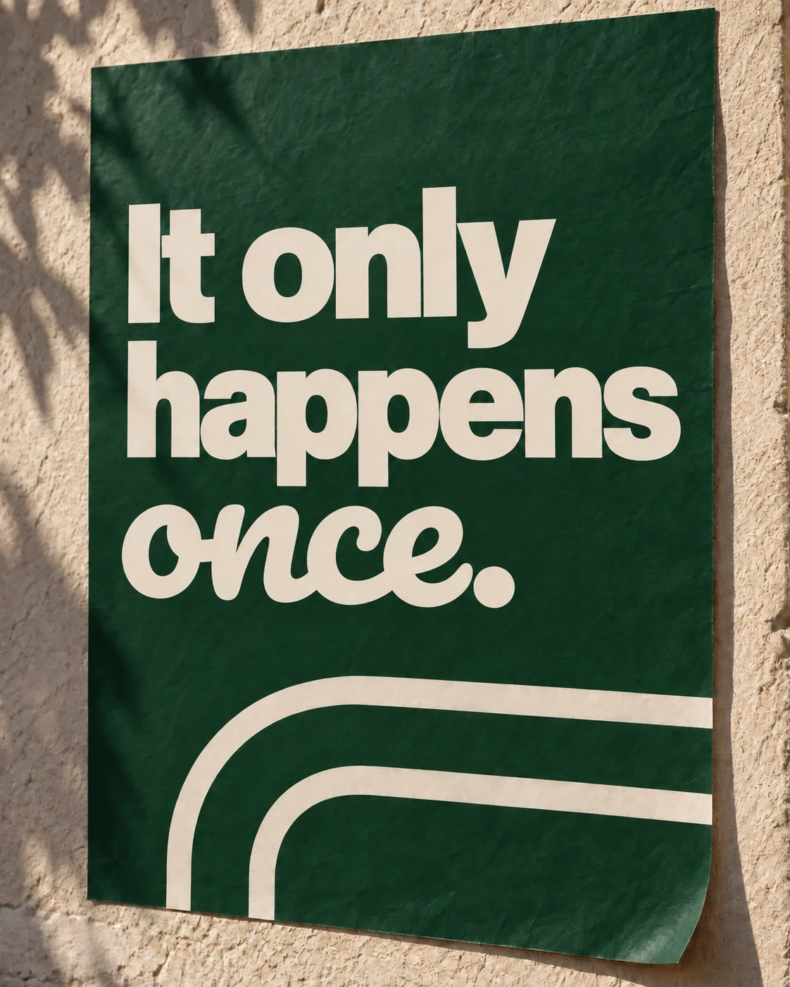
Our brand color palette is centered around Once Green, a bold depiction of luxury x personal. Though one singular color, our usage of Once Green pushes boundaries, from simple and straightforward, to textured and sensorial — ranging from software interfaces to marketing signage to hardware and packaging.
- Name:
- Once Green
- HEX:
- #154B37
Once Green
Once Green should be present across most brand touchpoints and used strategically such that it stands out as the hero color. Floods of green can be powerful, but that shouldn't be the only way green shows up, Once Green’s inclusion should be done thoughtfully and intentionally but frequently. Challenge yourself to meet this criteria in unexpected ways. Consider materiality, lighting, props, and styling as avenues to explore, and approach Once Green with nuance and refinement.






Supporting Colours
Black and white provide balance to Once Green, helping maintain visual clarity and avoid overuse of our signature color. They bring structure and contrast to compositions, allowing green to stand out where it matters most.
Light and dark Grey represent materiality and should be used to complement silver and gold in our product photography as well as for interface elements such as pills, subtitles, etc.
Paper can be used as a high-impact complement against Once Green.
- Name:
- Black
- HEX:
- #000000
- Name:
- White
- HEX:
- #FFFFFF
- Name:
- Light Grey
- HEX:
- #E7E6EA
- Name:
- Dark Grey
- HEX:
- #6E6E73
- Name:
- Paper
- HEX:
- #F3F0E7
Incorrect Usage
Do not alter the palette. Avoid the following treatments.
Don’t use colors that are obviously not part of the Once color palette — muddy brown, deep blue, bright yellow, and so on.
Use only the Once Green provided unless you have a very specific UI or accessibility need.
Gradients should be bright. If you are using gradients, make sure they do not turn brown or grey in between the start and end colors.
Once Green should be present in most circumstances where color ambiguity would hinder brand recognition.